|
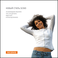
SCOVO restyling. Standards of a corporate style.In 2001 our company thought up the name and image of a
brand – the leading producer of the dishes
This is the first logo:
Now this trademark took a worthy place in the of a market segment; the following tasks became expansion of consumer audience at the expense of creation of more actual image of a brand. Restyling was coming. It was necessary to leave from a little archaic sounding of the ravine, from difficult reproduced contours and shadows and badly scaled horizontal strokes. The continuity and recognition of a trademark thus shouldn't disappear.
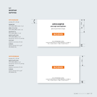
New logo:
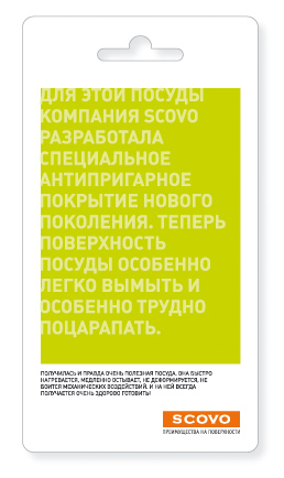
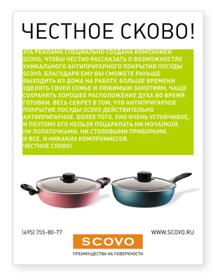
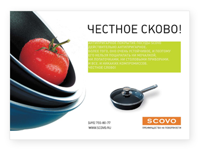
General slogan: ADVANTAGES ON the SURFACE
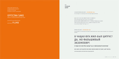
In new image the brand should become not
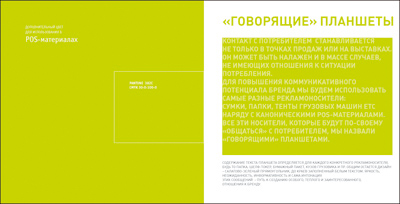
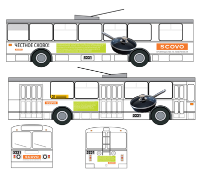
During campaign was planned to accustom consistently audience to reading – for the first time passengers of the subway should get acquainted with tablets, considering stickers on walls of cars.
In support of this already read and acquired information and a visual image should act boards on escalators, advertizing by buses etc.
|
|
domini.ru |
Contact Information
Contact us
+7 (495) 981−77−59 +7 (495) 981−77−52 info@domini.ru 
|
Choose Language
|
About Trust We don't mind of using our texts and images. Also we will be grateful if you don't forget to add our link.

|
|||